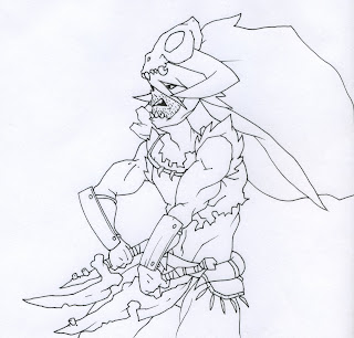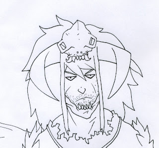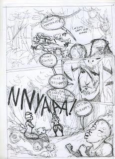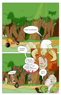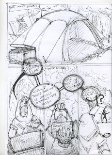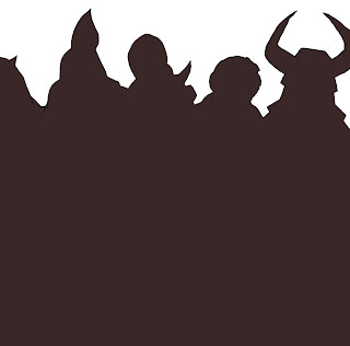

i decided to run with the second cover idea... i've got a few quotes from DA were i posted them for a vote.
"that looks much better as a front cover as it more front cover style , with main character and smalled sub characters and the monster im guessing is final foe? and the other is more like a movies advetisement that yu get on a bus or summet as it one charcter, like the starwars ones with yoda in one and trooper in other"
"very nice!! i just showed a friend and he said he wants to make it into a shirt in print class. would you mind if he did it?"
"Ah, this is super cool, holy crap! It's so... clean and shiny~ It's not confusing at all (which is sooo easy when you still lotsa characters together at once) and the shading is seriously excellent. And I actually think this would make a stronger image"
so yeah these guys agreed with me... there was only one person who preferred the watercolour image so its a win for these.
that little black and white djinn is kind of a private joke for anyone on the course because in 3 years this has been my only full colour project.. i dont know, i guess its not that funny. and i left the blurb text you'd usually find on the back cover of a comic or book off intentionally to kind of reinforce the fact that this is just a preview chapter... the ten pages themselves are kind of like a blurb to what could be a bigger project in the future.


